Problem & Core Needs
Although this was a course project, I tried to find a convergence between the course's requirement and my personal startup project (Tiscus). Luckily, we were offered the theme “Social Technology” this year, and I found a possible connection: quality time.
With this direction of “quality time” in mind, I sent out a survey to 12 UCSD students with some questions about “socializing”. Here were some interesting findings:
1) I asked for their ideal and realistic frequencies to socialize, finding out that
subjects only met around 70% of their ideal socializing frequency.
2) For the main reason that they failed to have a socializing event,
over 58.3% (7 out of 12) subjects indicated that it’s due to schedule conflicts.
3)
83.3% (10/12) subjects wanted someone to talk to / simply accompany them for a bit within the past 7 days (with respect to the time they filled out the survey).
With these findings, I confirmed that people want to socialize more via quality time. On the existing social media, users could see how their friends were having fun or going through certain events as well as texting them anytime. I’ve seen articles that complained about those superficial connections online; then,
what might a meaningful social connection be like? I interviewed my friends and received some insights:
With these insights, I came up with a more specific direction: In order to cultivate meaningful social connections,
people want something to help them reflect upon their memories with a certain friend and share some feelings that they might not usually share. I designed an experience prototype to continue exploring this problem statement. Generally, the prototype was a sweet mutual recap/record of feelings after a social activity. Here’s my concrete process for testing:
I interviewed 2 pairs of female friends, and all the 4 subjects
smiled at least once throughout the process of writing. Both subjects who finished writing earlier than peers
didn’t want me to deliver the message until another person also finished. After I delivered the paper, they
immediately asked me if they could unfold and read, in a tone filled with excitement.
While I compared this process with the UX of other social media, one thing raised my interest: on every existing social medium, messages are immediately sent and readable, which was contrary to what participants chose to do in my experience prototype.
The action of “waiting” helped generate surprises (the 2nd pair happened to write about the same thing for one question)
and enabled users to write more genuinely (not being limited to a response to friends). Instead of copying the instant message delivering feature in most apps, my app should display the letter content only after both sides finish writing.
In the following assignments, I was grouped with my wonderful teammates Chau and David, and we worked out the competitive audit together. We called our app Weeth, which derives from “Meet with”(flip “M” upside down).
We noticed that even though users could
“share something deeper” in some existing social media, they were not encouraged to do so. Another thing was that although users could
“record and view events between them and a certain friend” on existing apps, it took a lot of effort; they had to either browse through that friend’s posts or their own posts to find out their shared events. Lastly, no existing app
provides a timeline that focuses on quality time, but Weeth can provide.
With these possible core competitiveness in mind, we refined our problem statement to
“Social media users need something to establish deeper social connections via quality time.” Then we began storyboarding.
Storyboards & Prototype
While we brainstormed for storyboards, we tried to explore the emotional needs. Instead of presenting a practical problem,
we presented a moment where people might suddenly feel disconnected or lonely, showing how Weeth can provide heart-warming solutions.
Then we created a paper prototype for 6 main screens:
1) Home screen: view events and access other features
2) New event page: set up an event with friends
3) Friends page: View or add friends
4) One friend’s page: View the memories you share with this friend
5) Letter page: Write your feelings after an event
6) View letter page: View what you’ve written and received from a friend
After testing our paper prototype, we learned that users were confused about the list of events on the home screen, and they
prefered something that looked more like a timeline. Also, we noticed that users had to click “back” 4 times from Letter page to Home screen, so we
added a “home” icon on One friend’s page to simplify users’ operations. Below is our digital low-fi prototype, and the 3 pages in the second row were placeholder pages to be designed later.
Then we conducted more user testings and made iterations.
Testings & Iterations
After finishing creating the wireframes, we moved on to the phase of testing with actual real life users (a high school student, a college student and a middle aged woman).
We chose these 3 testers to understand if our design was applicable for different age groups, because “socializing” is a need throughout a person’s life. From the testing phase, we received positive feedback that complimented our user experience flow that easily made sense to follow with while using the app. We made small changes below:
I. Location of Home Button
For all the three testers, they explicitly shared that the old position of the Home button is not convenient or intuitive, as there was a big reach for their fingers from the button on the top right to the navigation bar on the bottom. Hence, we included the home button to the navigation bar to reduce the long reach for future users.
II. Indicate friends’ clickability
We noticed that when testers came to the screen that displays the list of friends, they only glanced over the page without any further actions. In other words, they did not know the friends’ names were clickable. Therefore, we redesigned the page by adding arrows next to each friend’s name to indicate their click-ability.
III. A/B Testing
Lastly, one of our core features is allowing users to create a new event for each time they hang out. Hence, we conducted A/B Testing to further investigate
if our new design (Prototype A) for the “Add New Event” button would drive users to initiate events more.
We attained the sessions (users) of each variant from Google Optimize,
23 sessions for prototype A and 17 sessions for prototype B. Then we attained the total conversions from Google Analytics, because Google Optimize doesn’t capture the conversions on other pages that include the navigation bar.
After removing the testing case,
we found that there were 8 total conversions for prototype A and 9 total conversions for prototype B. We performed the chi-squared test as indicated below.
Since the result was not statistically significant, we sent out a follow-up survey to gather people’s comments on the two versions. Due to the time constraint, we only received 9 responses, and
66.7% (6/9) of subjects prefered version B because the salient button “emphasizes the main function/the function I’d use the most” and “easier to notice that it’s there”. The remaining 33.3% (3/9) of subjects prefered version A because it’s “more consistent” and “less distracting”. With the majority’s preference, we decided to adopt design A.
Final Design
Below is our final design:
Below is an interactive prototype I embedded via iframe (
source url). We only designed for mobile view in Cogs 120. Here's the link to our
github repo. Feel free to view our code!
Finally, how does it connect with Tiscus? Similar to the mini-programs on WeChat,
Weeth shall be opened from Tiscus as a new tab in browser or a new app in phone. By clicking the Tiscus logo on the top left, users can go back to Tiscus (the new tab or app will be auto-closed).
The addition of Weeth will create 1+1>2 impacts for Tiscus
with an emphasis on “quality time” and “genuine feelings”, and the TcMeet feature may aid Weeth in hangout scheduling (need to redesign UX for integration). From interviews and online comments, I realize that many people feel disconnected despite clicking tons of “likes” on social media; I wish that Weeth (Tiscus) will help people feel more connected.
Project Manage
I served as the project manager in our team. Every week, I evaluated the priority of different goals with my teammates, proposed possible ways to break down the tasks, and adjusted the task allocation dynamically.
Here's the link to our
development timeline (below is a preview).
One interesting problem I came across was our version control. I knew that generally, we could use different branches on github to do it. However, in the first four weeks (before we started the group project), we developed the habit of pushing our assignments directly to the master as instructed.
Should we overcome our habit and use branches for version control? Here’s the tension:
I shared the possible errors and results with teammates and asked them to be careful.
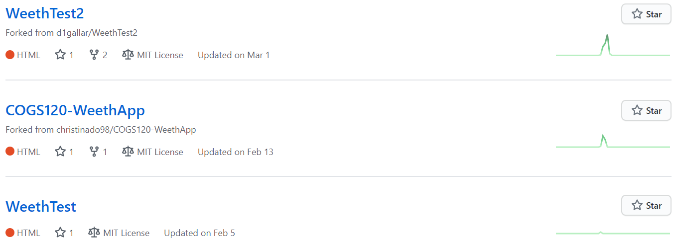
However, such errors continued to occur (I thought there should be at least a warning before overwriting, but maybe the situations of my teammates were different). Eventually, I proposed to do version control through different github repos (as shown below), and it worked out well.

*We used the template provided by Prof. Scott Klemmer (from MIT), perhaps that's why it shows MIT License
Reflecting back, I realized that human-centered design is not just about products; it lies in every interaction we have with each other. If people around me (teammates/friends/families) often make similar “mistakes”, I should try to understand why instead of directly requiring them to do the "correct" things,
because what's "correct" to me might not be the best design for them. With more understanding for each other, we can work out better solutions!


